it doesn’t look right, I don’t actually know what font they use
You must log in or register to comment.
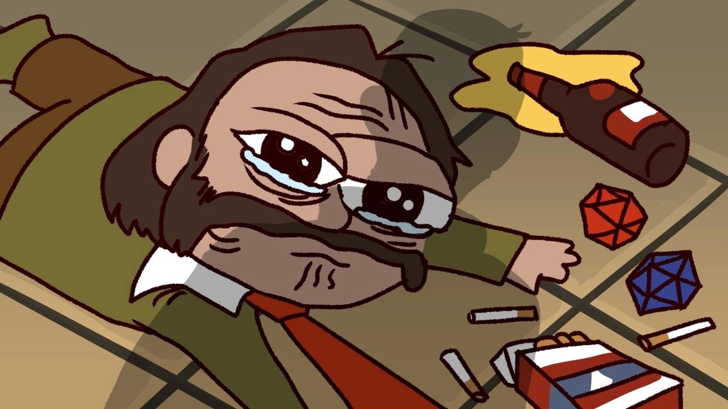
His face is too big. He doesn’t look FAS enough.
Keep texting from overlapping backgrounds that don’t contrast well, like his shoulder.
Otherwise it is solid.
Okay fixed it. Thank you!
Perfection.
yeah, face too big
it doesn’t look right
I think the problem is his face hasn’t been altered.
naw i think it got moved a bit, just not resized
I was gonna say his face is too big, someone photoshopped it.
mmmm it seems the ratio must be perfect then to cause confusion 🤔
Good to see the Kirk Slider (https://blovish.github.io/kirkslider/) is still active.
we gotta add a blowhole option
Point at the neck


